Hacker News on a plane
How much of Hacker News can I recreate on a plane ride with no internet?
I recently found myself on a set of long flights, and I needed a way to keep busy. Inspired by Ahmad Shadeed's exploration of the CSS behind Threads, I decided that a good way to busy myself would be to test my HTML and CSS knowledge by reproducing the look and feel of Hacker News as closely as possible in static site form (i.e. all frontend, no backend).
The only preparation I allowed myself beforehand was a few screenshots of key pages and an NPM project with some packages for building a static site, namely Eleventy and SASS. Beyond that, I'd have to rely on whatever knowledge I could pull off the top of my head for layout and styling; I wouldn't have any internet resources to reference.
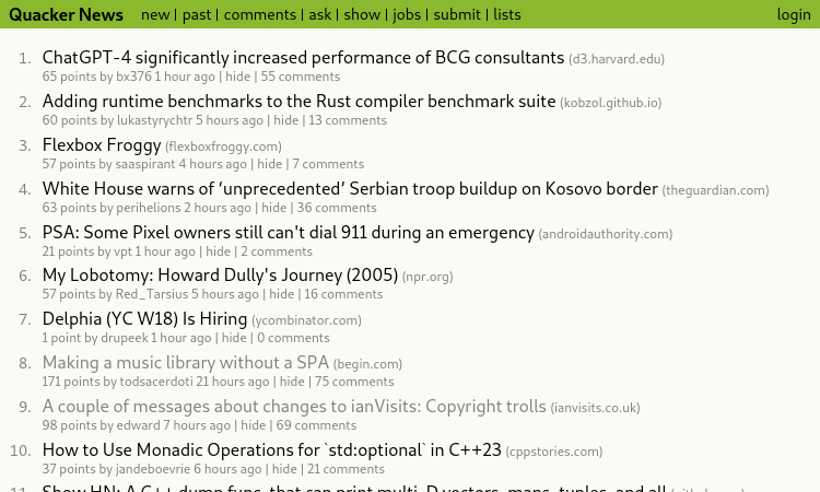
The end result: Quacker News!
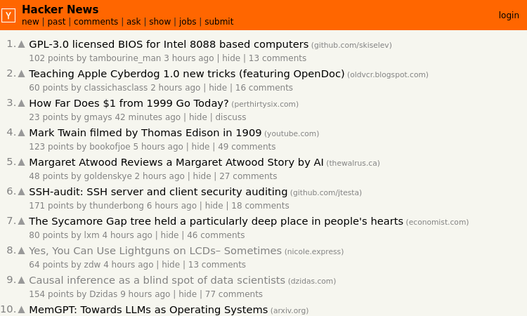
Here's the real Hacker News for comparison:
I will admit that I cheated a little bit: I used a brief layover and some free airport wifi to grab a bunch of actual Hacker News data using the Hacker News API. Mock data would have been a pain otherwise.
How'd I do?
Here's what I managed to get done:
- Homepage: I used Eleventy pagination to create three pages of items total.
- Story Pages w/ Comments: I used a recursive Nunjucks macro to create properly nested comments for every item.
- User Profiles: Profiles exist for users who submitted any of the story items on the homepage.
There's a lot that's missing, including many pages (there are a lot of dead links), extra functionality when logged in, and smaller details like "XYZ Is Hiring" items. One big miss is any items that have user-submitted text on the item page; that text does not exist on Quacker News.
Overall, though, I'm pretty happy with it! I got the big portions that I really cared about done, and I achieved a faithful imitation without going pixel-for-pixel.
Similar appearance; divergent approach
Before attempting this challenge, I knew that Quacker News would have a vastly differeny HTML/CSS structure from Hacker News. The orange website, which has been around since 2007, creates its layout using carefully constructed table elements. Before the advent of flex and grid, such hacks were the best method for creating more complex layouts.
Quacker News eschews table layouts in favor of flexbox, along with more semantic HTML throughout. Each page has a header, main, and footer. The list of items on the homepage uses an actual ol to provide the numbering, and each item is wrapped inside an article. I didn't spend much time on the semantics of comments, unfortunately.
The CSS I chose was straight-forward. There were two details I was particularly happy with, however:
-
For the list of links in the header and footer, Hacker News uses literal | characters to divide the list. I chose to combine the
::beforepseudo-elements and a lobotomized owl selector to replicate the look. I love how it turned out. - Also in the header, I used nested flexboxes to create a responsive layout without requiring media queries. As the width of the window decreases, the site title and list of links wrap vertically, then each link in the list starts to wrap vertically after that.
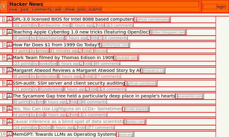
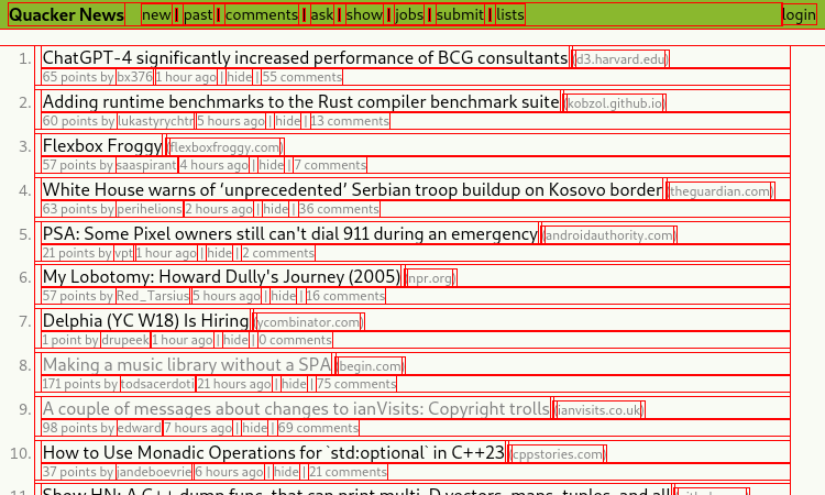
I used the old CSS debugging trick of surrounding every element with a red outline to compare the two sites. I don't think this is a particularly useful comparison for determining whether one site is "better" than the other, but it is interesting to see the differences.
It's fun to see how HTML and CSS have evolved over time to make the process of building layouts feel far more intuitive. I'm also impressed that Hacker News pulls off its layout without the modern utilities that I simply couldn't live without.
A great personal challenge
This project turned out to be a blast, and I had way more fun with it than expected. The tools at my disposal were a huge reason why: combining Eleventy's data cascade with a dump of data from the Hacker News API allowed me to scaffold a huge number of pages for Quacker News with very little effort, allowing me to focus on the frontend skills I really wanted to practice.
It was also a great exercise to try and recreate a site I'm familiar with, compare approaches, and see what I could have done better. This certainly won't be the last time I attempt to replicate a site on my own.